⬅ Go Back
ARTWORK
Helvetica Poster
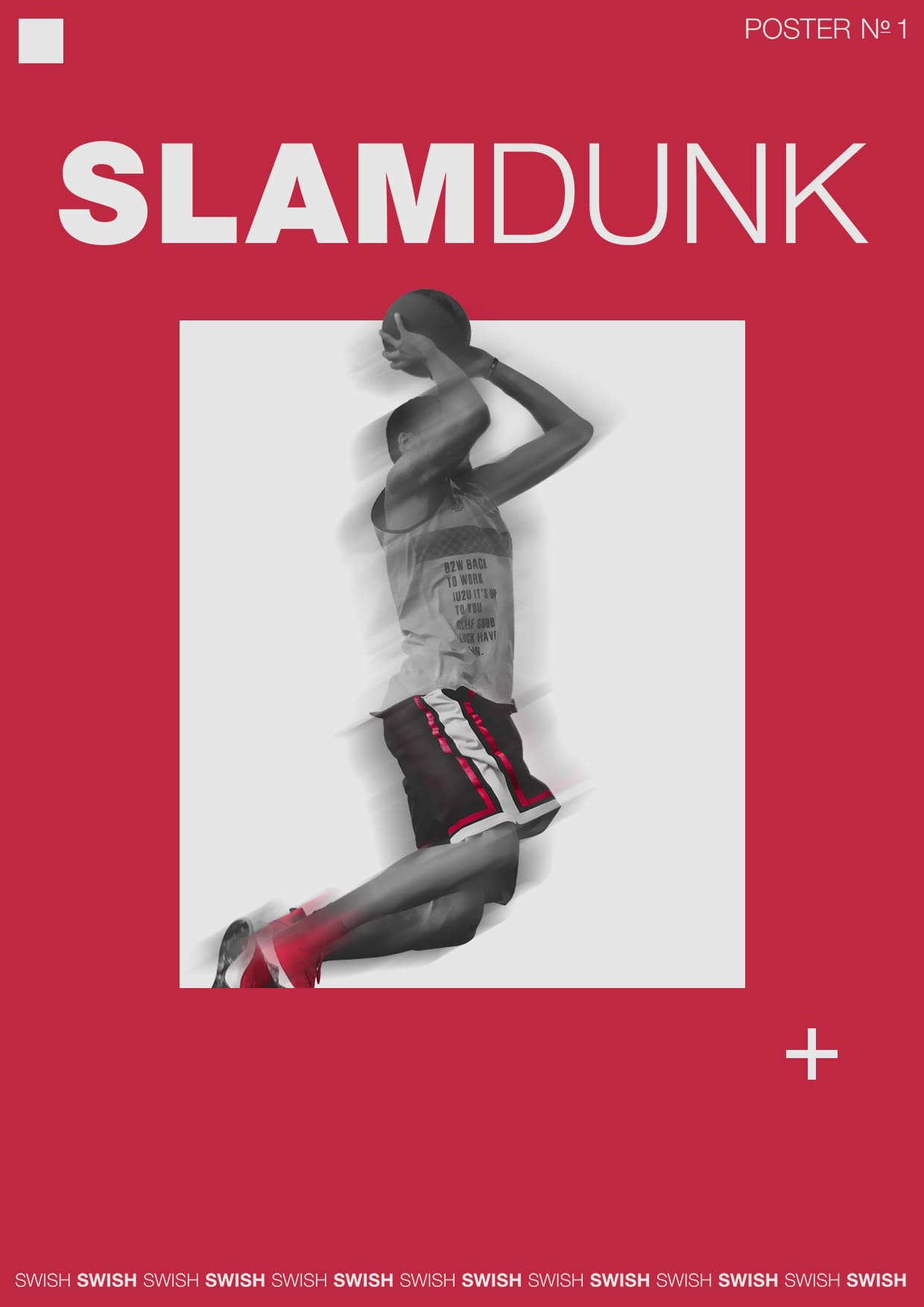
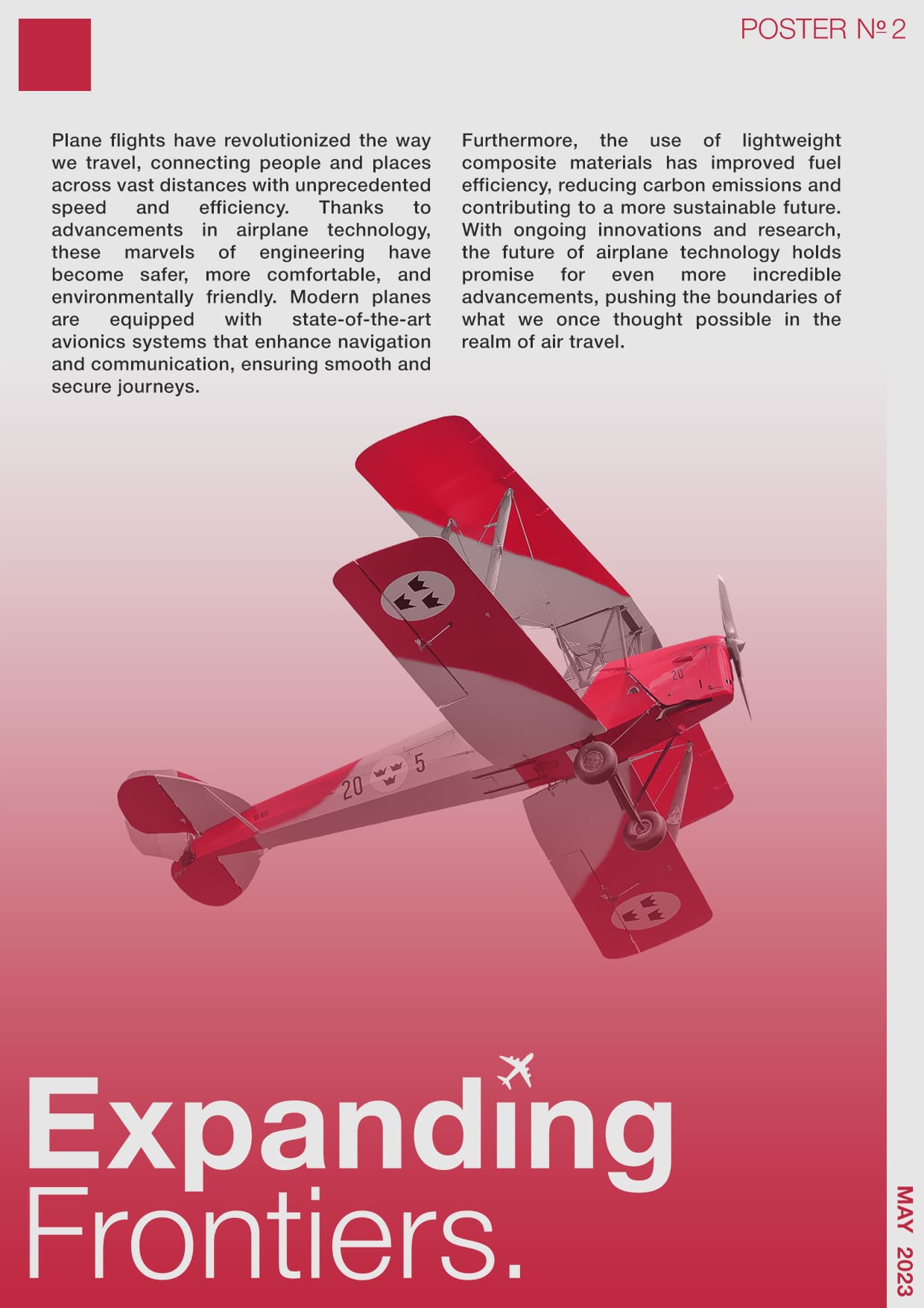
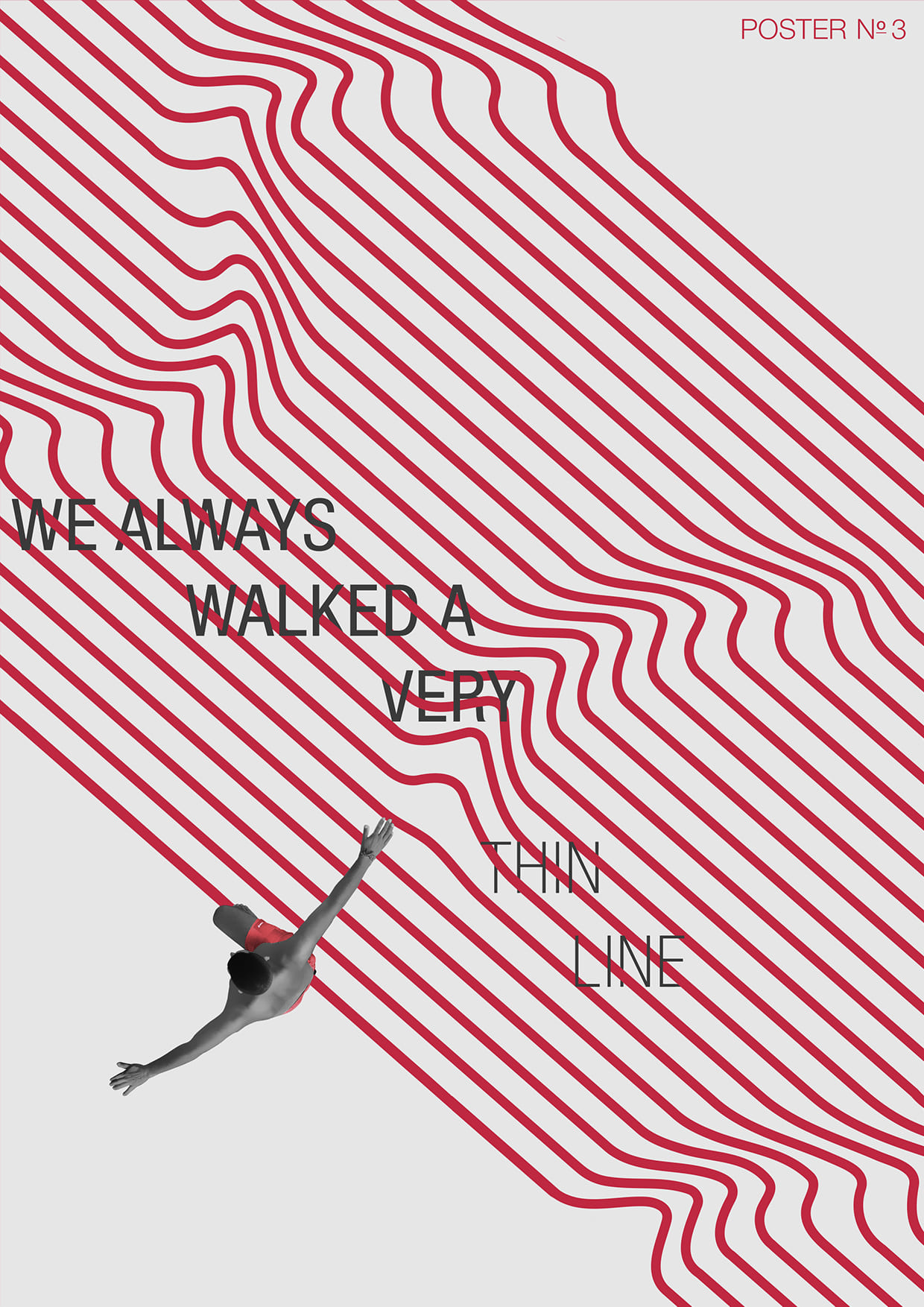
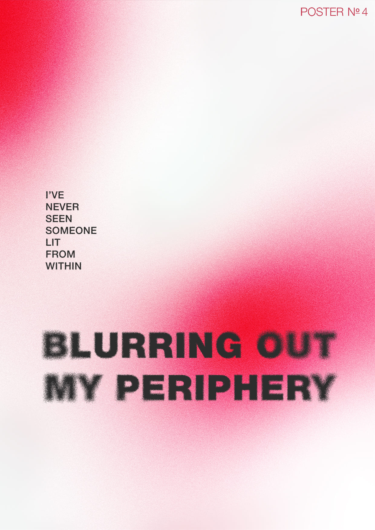
This is a collection of posters inspired by the early Helvetica design style of the 1950s that utilizes the Helvetica typeface in creating visually appealing and impactful posters. Helvetica is a widely used sans-serif typeface that was developed in the 1950s and has since become one of the most popular and influential fonts in the world of graphic design.
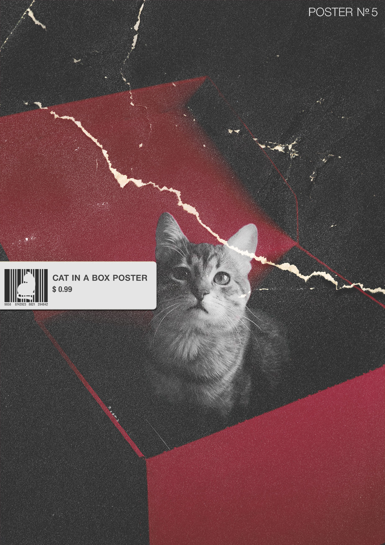
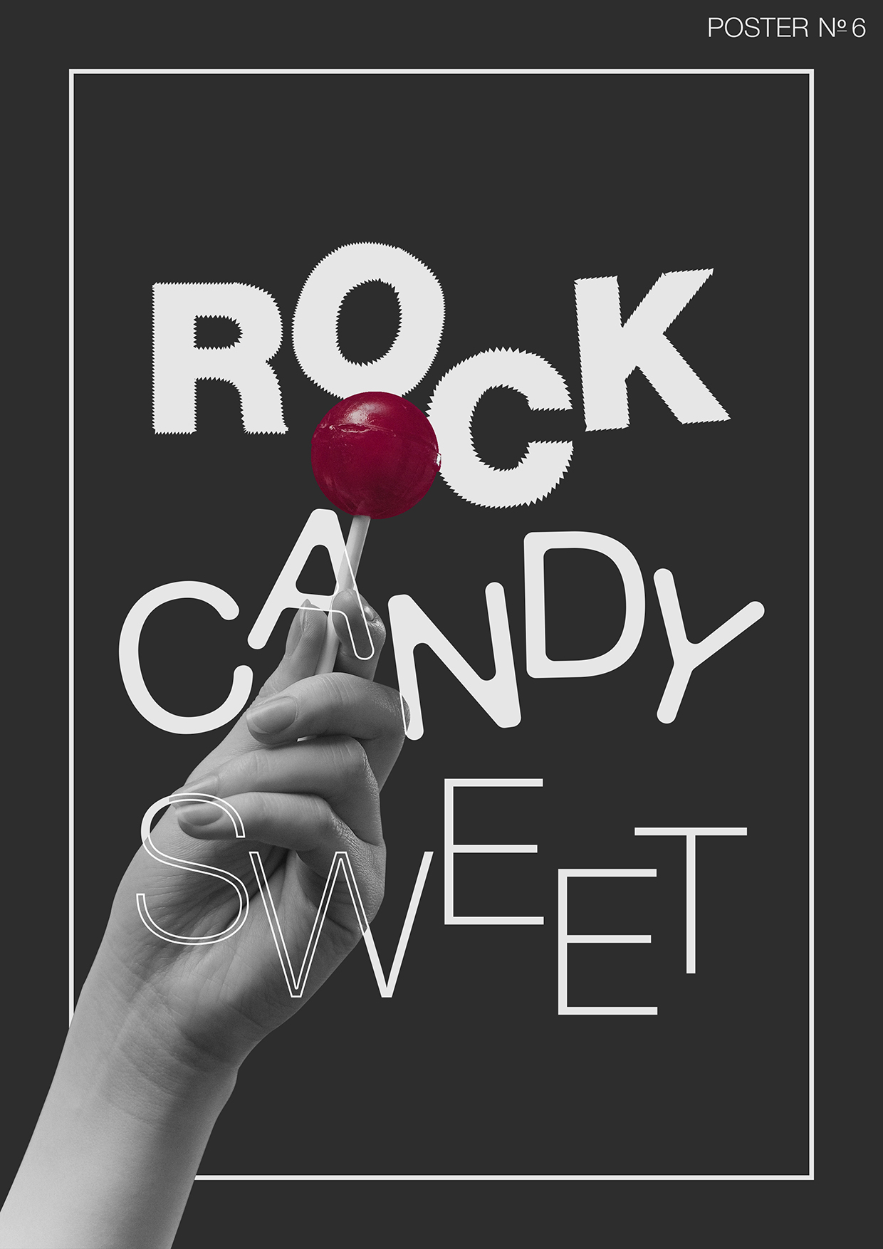
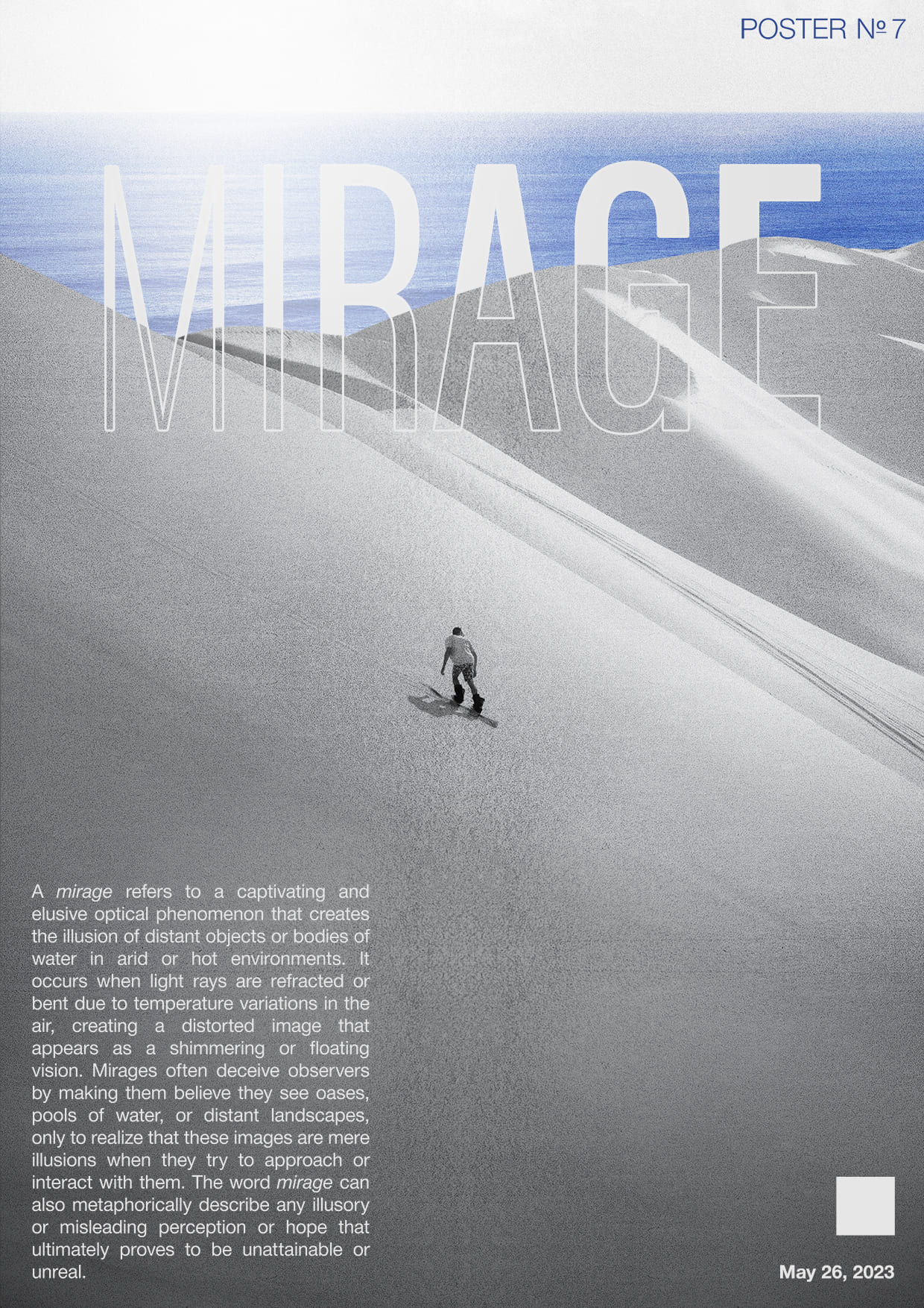
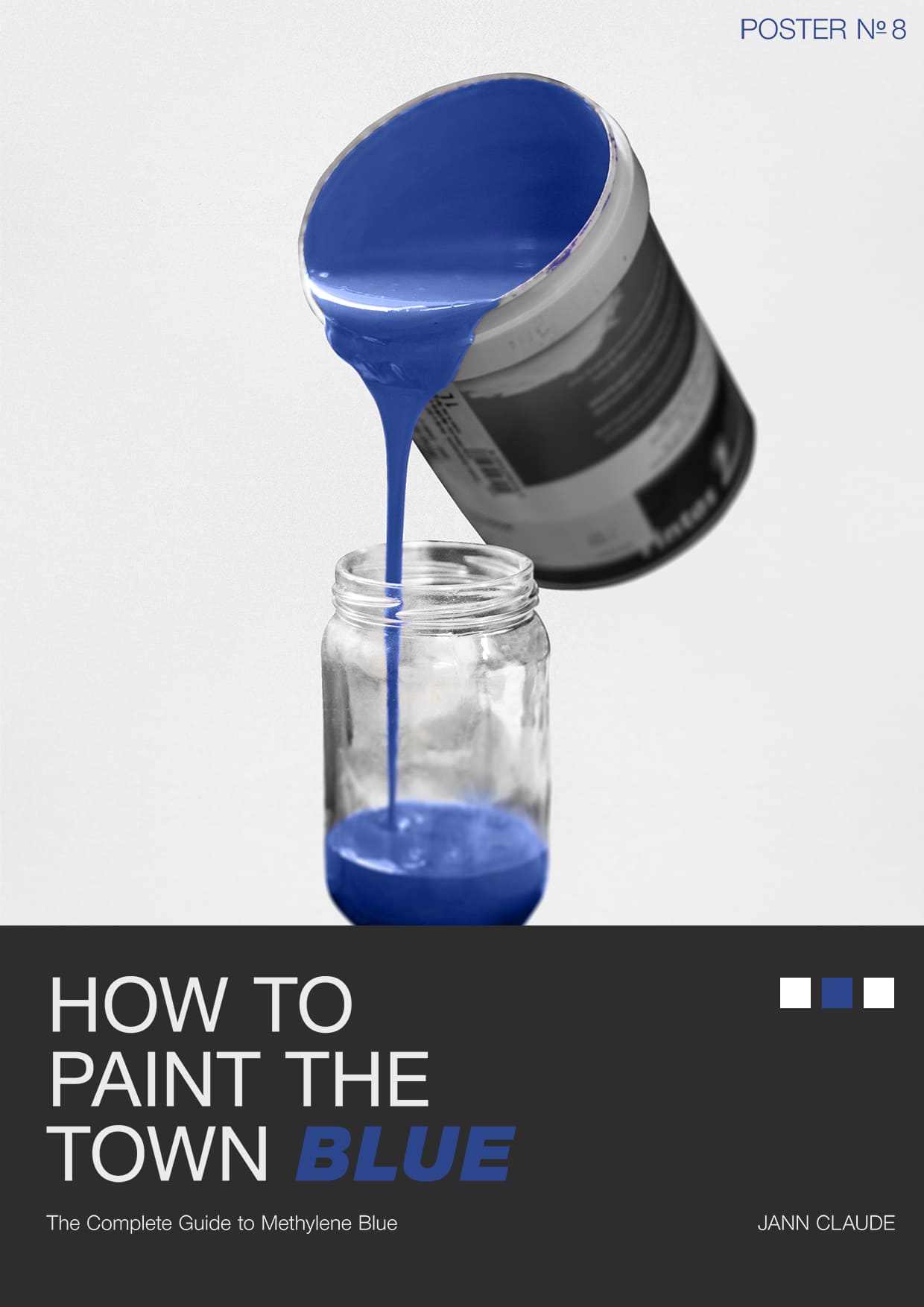
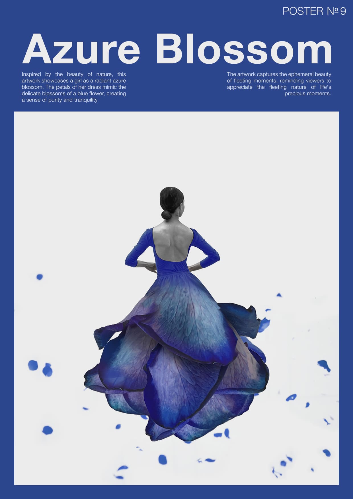
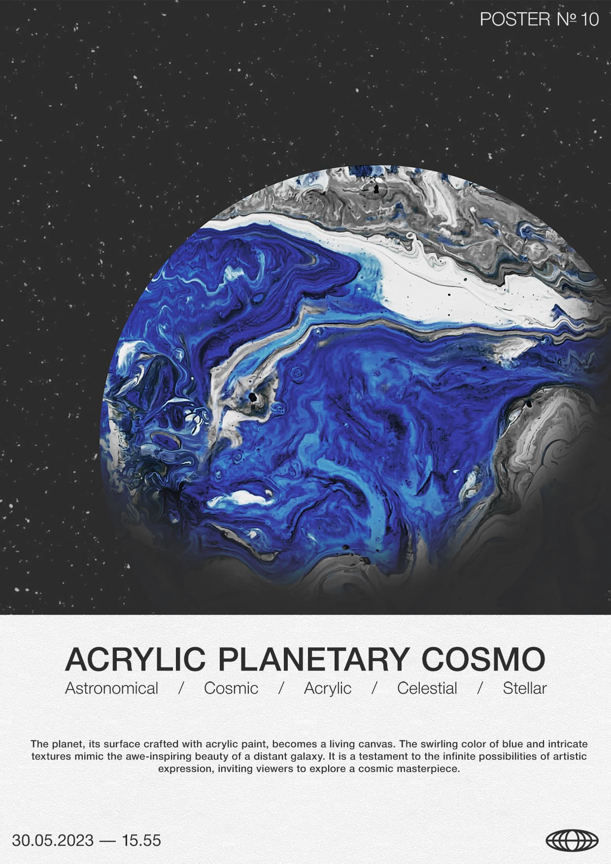
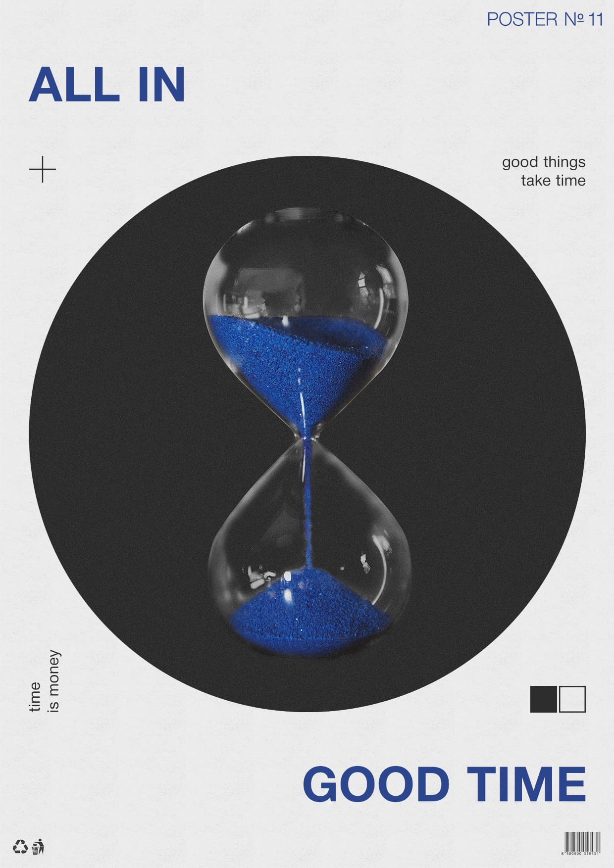
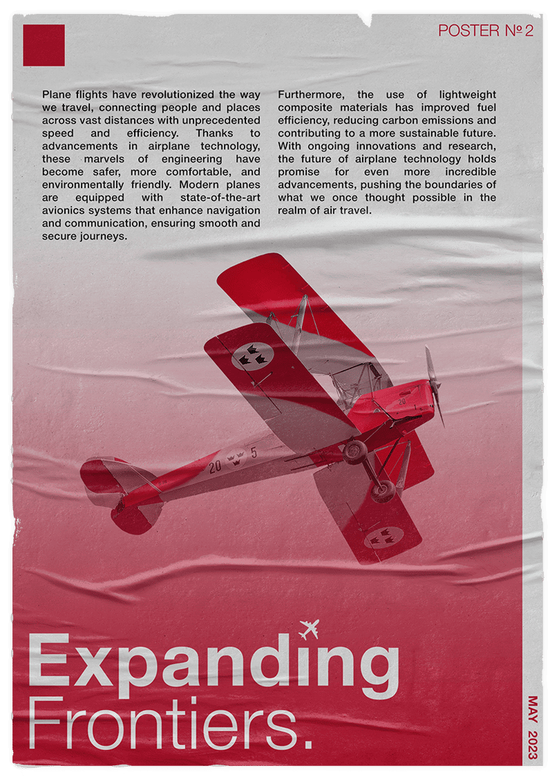
When creating these posters, I relied on the distinct characteristics of the Helvetica typeface to convey the intended message or evoke a specific mood or tone. The simplicity and clarity of the font was used to emphasize key words or phrases, while the overall composition, layout, color scheme, and imagery play a significant role in creating a visually appealing and engaging poster. In this first volume, I played around with two colors, red and blue, to give contrast and visual impact created by the color combination. Red and blue was used to evoke different emotions and associations depending on their specific context, for example—red is associated with energy, passion, and attention-grabbing qualities. On the other end of the spectrum, blue is often associated with qualities like trust, calmness, and stability.
It was purposeful that the color choice should align with the intended message or meaning of the artwork to ensure that they reinforce the purpose of the posters.
Artwork
Adobe Photoshop
2023